
Leica Store SoHo
Leica Store SoHo
Leica Store SoHo
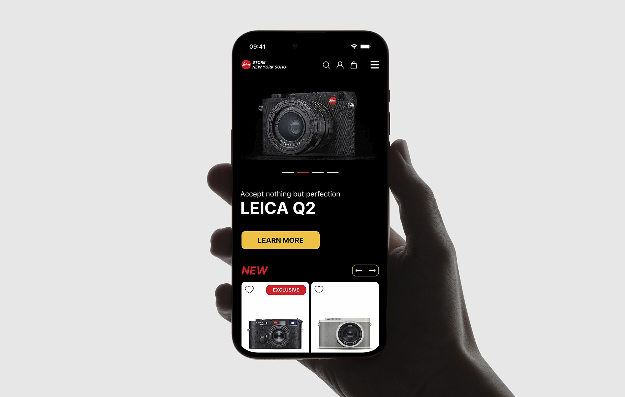
With OSMOS, I redesigned the whole website for Leica's New York flagship store, from the homepage and catalog to the journal and checkout, so it lived up to the brand's photographic legacy. Checkout completion rose from 50% to 58%.
Impact
50% → 58% checkout completion (+16% relative)
+30% social engagement across the program
With OSMOS, I redesigned the whole website for Leica's New York flagship store, from the homepage and catalog to the journal and checkout, so it lived up to the brand's photographic legacy. Checkout completion rose from 50% to 58%.
Impact
50% → 58% checkout completion (+16% relative)
+30% social engagement across the program
The problem: Leica Store SoHo isn't an ordinary camera shop. It's the brand's New York flagship and a destination for photographers. Its old website didn't show that. Products were presented like any other retailer's, the brand's artistic side was missing, and the buying path made it too easy to drop a purchase people had spent weeks considering. The redesign had to work as both a premium store and a showcase for photography.
The problem: Leica Store SoHo isn't an ordinary camera shop. It's the brand's New York flagship and a destination for photographers. Its old website didn't show that. Products were presented like any other retailer's, the brand's artistic side was missing, and the buying path made it too easy to drop a purchase people had spent weeks considering. The redesign had to work as both a premium store and a showcase for photography.
Key decisions:
1. Redesign the whole experience, not single pages. I rebuilt the site as one system: the homepage, navigation, catalog, product pages, journal, and checkout all share one structure and one visual language, so the brand feels the same everywhere.
2. Let photography lead. Restrained layouts, generous space, and precise type keep the interface quiet so the images and products carry the brand. A sticky header keeps navigation within reach without competing with them.
3. Product pages built for comparison. Large imagery first, then specs grouped the way buyers compare bodies and lenses, with availability and purchase details next to the add-to-cart button.
4. A checkout as precise as the camera. Fewer steps and an order summary that stays visible on mobile, so nobody has to back out to double-check a four-figure order.
Key decisions:
1. Redesign the whole experience, not single pages. I rebuilt the site as one system: the homepage, navigation, catalog, product pages, journal, and checkout all share one structure and one visual language, so the brand feels the same everywhere.
2. Let photography lead. Restrained layouts, generous space, and precise type keep the interface quiet so the images and products carry the brand. A sticky header keeps navigation within reach without competing with them.
3. Product pages built for comparison. Large imagery first, then specs grouped the way buyers compare bodies and lenses, with availability and purchase details next to the add-to-cart button.
4. A checkout as precise as the camera. Fewer steps and an order summary that stays visible on mobile, so nobody has to back out to double-check a four-figure order.
Results: The new site launched in 2022 as one consistent experience, from homepage to order confirmation.
Results: The new site launched in 2022 as one consistent experience, from homepage to order confirmation.


@ 2026 Kirill Pikalov