
SRVC Studio
SRVC Studio
SRVC Studio
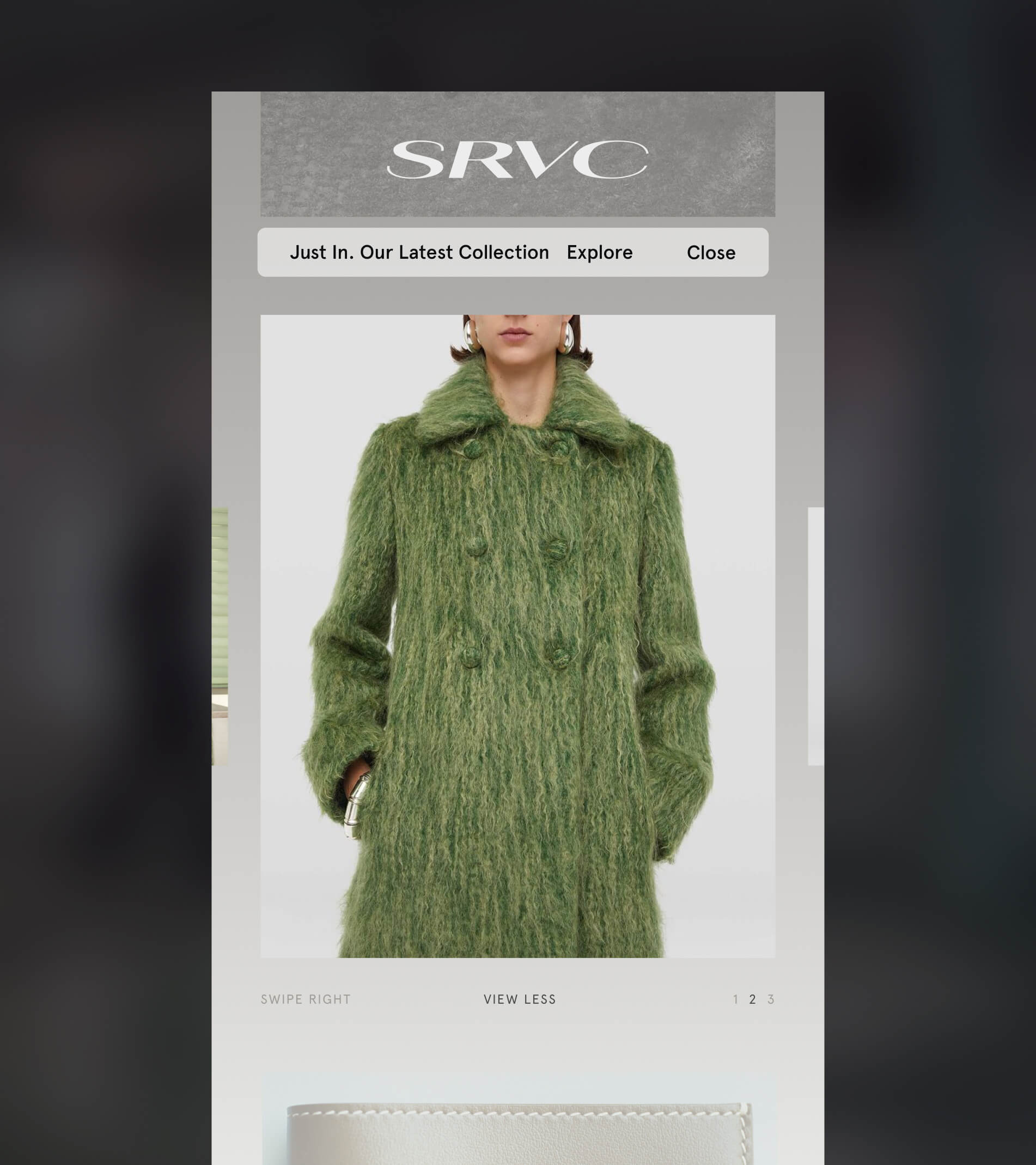
I designed SRVC Studio's identity and website: a wide serif wordmark, a quiet grey palette, and a site that moves like a runway show. Collections and the store sit underneath, a click away.
I designed SRVC Studio's identity and website: a wide serif wordmark, a quiet grey palette, and a site that moves like a runway show. Collections and the store sit underneath, a click away.
The problem: SRVC releases seasonal collections with strong runway and editorial imagery. A standard store template would have flattened all of that into a product grid. The label needed a site that felt like the brand first and still let people explore every season and shop.
The problem: SRVC releases seasonal collections with strong runway and editorial imagery. A standard store template would have flattened all of that into a product grid. The label needed a site that felt like the brand first and still let people explore every season and shop.
Key decisions:
1. A restrained identity that lets the clothes lead. A wide, high-contrast serif wordmark, paired with Apercu and Apercu Mono for a technical, archival feel.
2. Open on the show, not the shop. The homepage opens on full-bleed runway imagery, with a small "Just in" banner pointing to the latest collection.
3. One overlay for everything else. About, collections, contact, and newsletter signup live in a single blurred overlay, so navigation never covers the imagery for long.
4. Built for the thumb. On mobile, collections become a swipeable gallery with simple page markers, and the menu becomes a full-screen panel.
Key decisions:
1. A restrained identity that lets the clothes lead. A wide, high-contrast serif wordmark, paired with Apercu and Apercu Mono for a technical, archival feel.
2. Open on the show, not the shop. The homepage opens on full-bleed runway imagery, with a small "Just in" banner pointing to the latest collection.
3. One overlay for everything else. About, collections, contact, and newsletter signup live in a single blurred overlay, so navigation never covers the imagery for long.
4. Built for the thumb. On mobile, collections become a swipeable gallery with simple page markers, and the menu becomes a full-screen panel.
Results: SRVC launched with a complete identity system and a website that works as both a lookbook and a store. Every new season fits the same structure, with no redesign needed.
Results: SRVC launched with a complete identity system and a website that works as both a lookbook and a store. Every new season fits the same structure, with no redesign needed.




@ 2026 Kirill Pikalov