
Voyage for Good
Voyage for Good
Voyage for Good
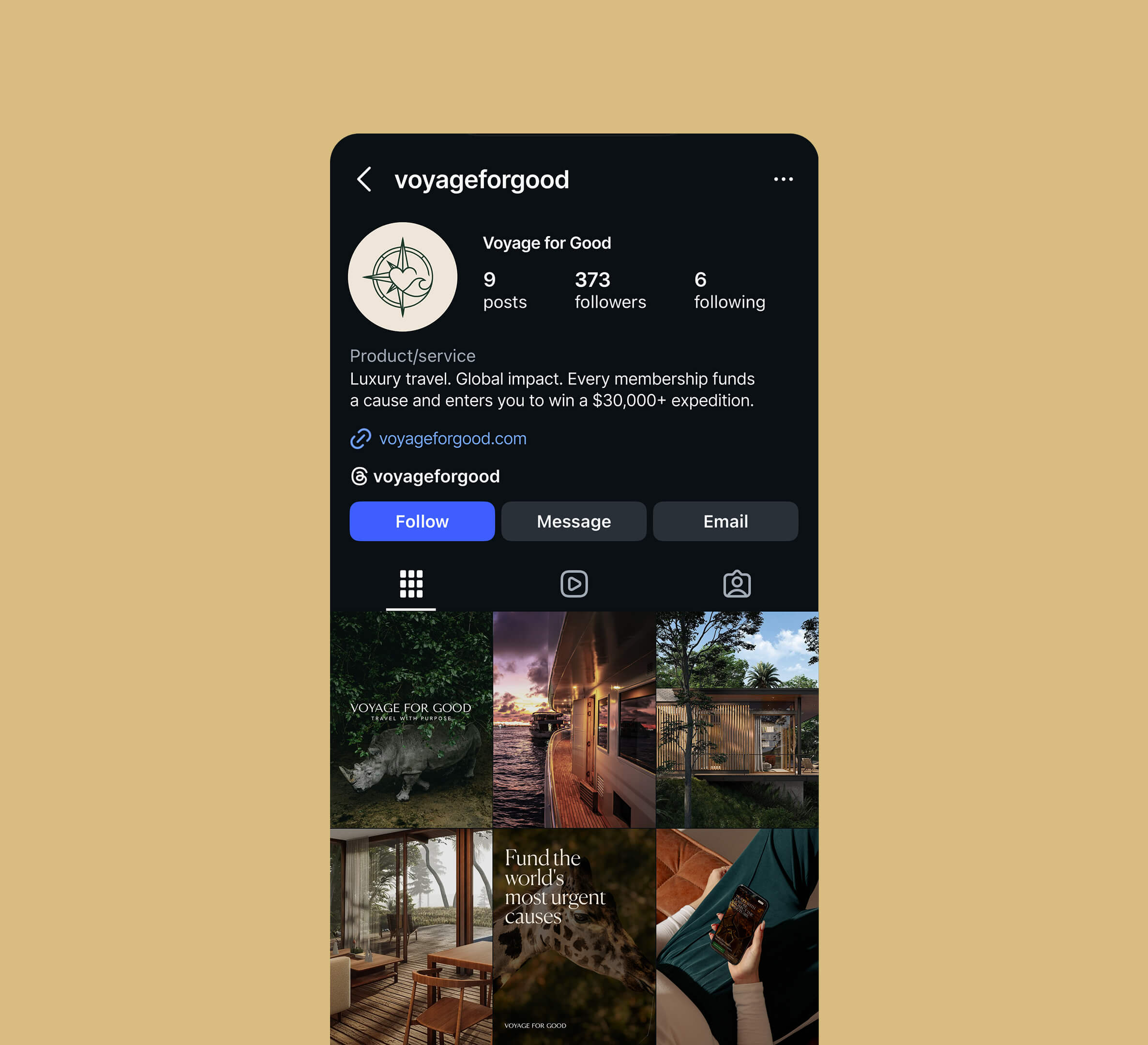
A membership where monthly contributions fund global causes and enter members into curated luxury expeditions. I designed and built the whole thing in Framer: brand, nine core screens, trip pages, member dashboard, and a founders waitlist.
Impact:
9 core screens, 3 expedition pages, live
339 VIP Founders Waitlist signups before the first quarter opens
38% of waitlist visitors viewed an expedition page first
A membership where monthly contributions fund global causes and enter members into curated luxury expeditions. I designed and built the whole thing in Framer: brand, nine core screens, trip pages, member dashboard, and a founders waitlist.
Impact:
9 core screens, 3 expedition pages, live
339 VIP Founders Waitlist signups before the first quarter opens
38% of waitlist visitors viewed an expedition page first
The problem: Charity, sweepstakes, and subscriptions each make people skeptical on their own. Voyage for Good combines all three. The site had to feel like a high-end travel brand, explain the mechanics like a transparent nonprofit, and make the recurring commitment obvious, all before asking anyone to join.
The problem: Charity, sweepstakes, and subscriptions each make people skeptical on their own. Voyage for Good combines all three. The site had to feel like a high-end travel brand, explain the mechanics like a transparent nonprofit, and make the recurring commitment obvious, all before asking anyone to join.
Key decisions:
1. Sell the trip, then explain the model. Destinations lead with full-bleed editorial imagery on a forest green and warm ivory palette. The mechanics (how contributions work, where money goes, how entries are earned) come second, in plain language.
2. Make the monthly price impossible to miss. The tier comparison puts price, entries, and impact per tier side by side. Nobody should find out it's recurring after they sign up.
3. Launch the waitlist before the product. When the first quarter moved to spring 2027, the primary call to action switched to a VIP Founders Waitlist, so the site started building demand instead of sitting behind "coming soon."
4. Give members a reason to come back. The member dashboard puts contributions, entries, and impact in one view, and ships as a PWA so it lives on the home screen.
Key decisions:
1. Sell the trip, then explain the model. Destinations lead with full-bleed editorial imagery on a forest green and warm ivory palette. The mechanics (how contributions work, where money goes, how entries are earned) come second, in plain language.
2. Make the monthly price impossible to miss. The tier comparison puts price, entries, and impact per tier side by side. Nobody should find out it's recurring after they sign up.
3. Launch the waitlist before the product. When the first quarter moved to spring 2027, the primary call to action switched to a VIP Founders Waitlist, so the site started building demand instead of sitting behind "coming soon."
4. Give members a reason to come back. The member dashboard puts contributions, entries, and impact in one view, and ships as a PWA so it lives on the home screen.
Results: In the first 8 weeks, 339 people joined the VIP Founders Waitlist, 4.6% of visitors signed up, and 38% of them explored an expedition page before joining.
Results: In the first 8 weeks, 339 people joined the VIP Founders Waitlist, 4.6% of visitors signed up, and 38% of them explored an expedition page before joining.




@ 2026 Kirill Pikalov